 OpenAI - ChatGPT, Sora
 Google - Gemini, Nano Banana
 Anthropic - Claude
 xAI - Grok
 Deepseek
 Alibaba - Qwen
 ByteDance - Doubao
 All Models
 Enterprise Plans
 AI Application Development
 AI Translator API
 AI SEO/GEO Service
 GEO-Optimized PR Service
 Web Scraping Service
 OpenClaw
 Top AI Tools
 Top AI Robots
 Log in


What is Google Charts?
Google Charts is an interactive, web-based data visualization tool that helps businesses and individuals create stunning, informative, and easy-to-understand charts. With its intuitive interface, users can quickly and easily bring their data to life by creating professional-grade charts in a variety of styles and formats.
Whether you're a data analyst, a marketer, or a student, Google Charts will help you create visually appealing and insightful data presentations that will make your data easier to understand and more impactful. From interactive line graphs and scatter plots to dynamic timelines and pie charts, Google Charts provides the perfect platform for turning complex data into meaningful visuals.
With its robust suite of features and data manipulation tools, you can create powerful and visually appealing charts that can be used in presentations, reports, or webpages. With Google Charts, you can quickly and easily bring your data to life and make it more engaging, insightful, and impactful.
Use Cases and Features
1. Create interactive line graphs to display data
Visualize trends and patterns in your datasets with dynamic, customizable line graphs that respond to user interactions and provide detailed insights into your data points.
2. Build dynamic timelines to show changes over time
Track historical data and demonstrate progression with engaging timeline visualizations that help audiences understand temporal relationships and evolutionary patterns.
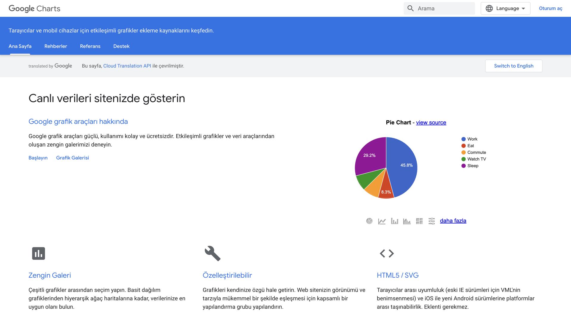
3. Generate pie charts to visualize proportions
Display compositional data and percentage distributions clearly with intuitive pie charts that make it easy to compare relative sizes and understand data segmentation at a glance.